Hello Moxie
Brand Refresh
Brand Refresh
Branding, Social Media graphics,
Iconography, Brand style guide
Iconography, Brand style guide
Hello Moxie is a mentorship-based leadership program for women in tech that combines 1:1 mentorship, small-group cohorts, and guided development work to help women grow their careers, build confidence, and lead more intentionally.
The challenges
The Hello Moxie visual brand overall was having accessibility problems across the brand.
Fonts | The team had found that their font system was hard to read across digital and print applications and they had defaulted to Helvetica to help with legibility in the short term. They were looking to create get a refreshed type system that was: accessible, reflective of our brand tone and core values, harmonious with our current logo and colors, WCAG-compliant in contrast and clarity. The team also wanted to have documented guidelines of font hierarchy and correct/incorrect usage.
Colors | The color palette itself had issues with accessibility and made it hard for the team to work with them. It also felt limiting in the visual depiction of "moxie." They were looking to refine the existing palette and determine what needed to be updated or enhanced, have it be WCAG-compliant in contrast, and the team also wanted to have documented guidelines of color hierarchy and correct/incorrect usage for print and digital.
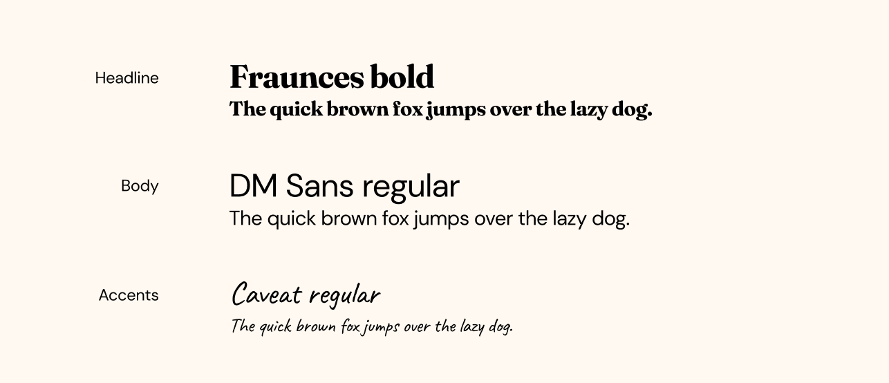
Font solution
This type system pairs expressive, editorial headlines with highly readable body copy. Fraunces adds character and confidence, DM Sans ensures clarity and accessibility across everyday use, and Caveat brings a subtle handwritten warmth for emphasis.
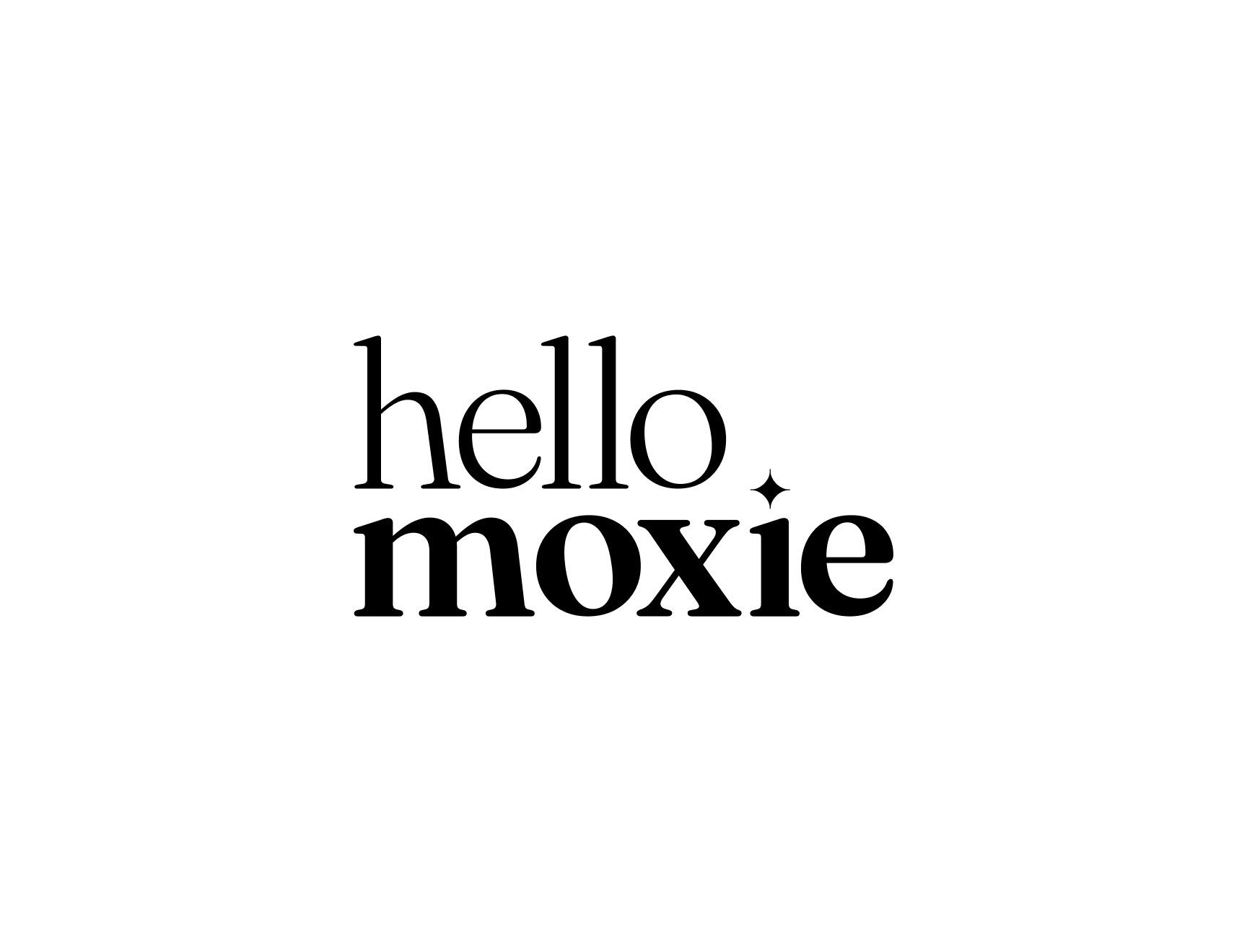
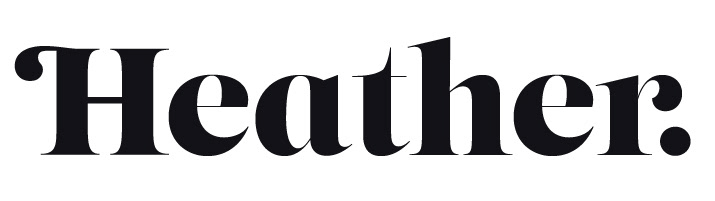
logo solution
While we had originally talked about not updating the logo because the brand was so new, we decided that because the font updates were similar (but more legible) to the original, that we could update the logo seamlessly.
Primary wordmark

Secondary icon
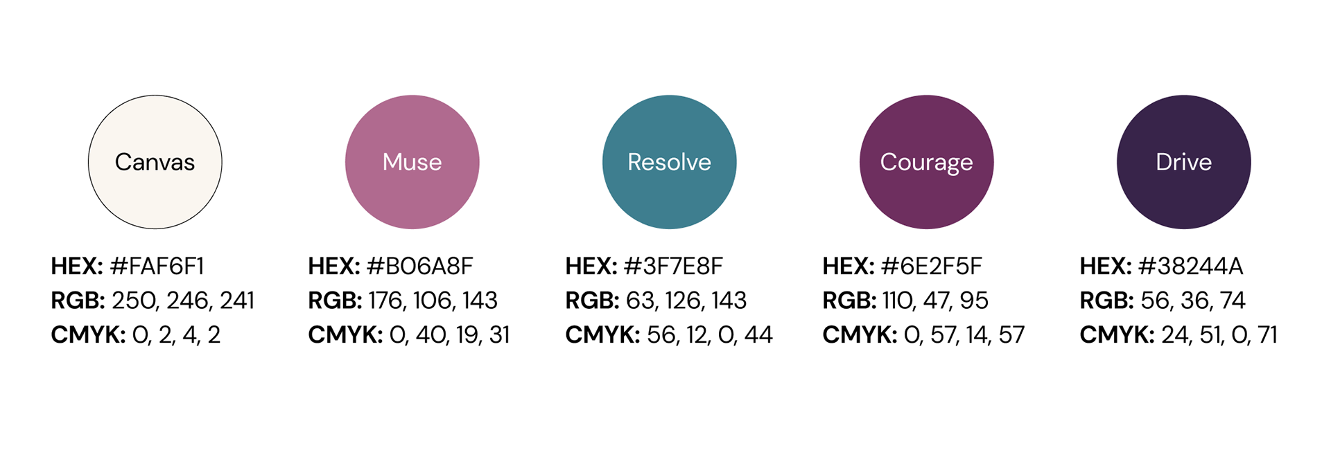
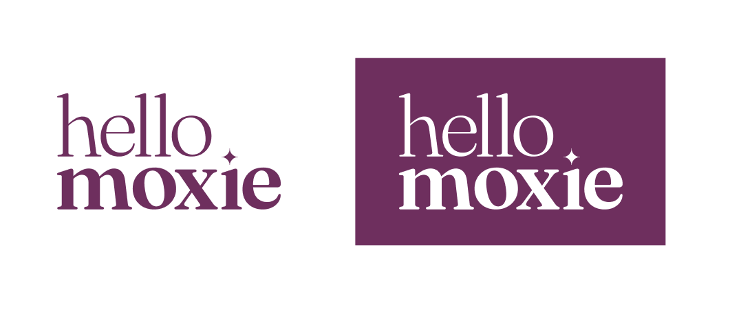
Color solution
Confident Evolution
The chosen color palette was the closest to Hello Moxie’s previous color system and was designed as a refined evolution rather than a rebrand.
The core hues, warmth, and femininity remain consistent, preserving brand recognition. Subtle increases in depth and saturation ensure that the palette WCAG accessibility standards (AA). This palette strengthens clarity, usability, and inclusivity across all touch points, while staying true to the brand’s existing look and feel.
The core hues, warmth, and femininity remain consistent, preserving brand recognition. Subtle increases in depth and saturation ensure that the palette WCAG accessibility standards (AA). This palette strengthens clarity, usability, and inclusivity across all touch points, while staying true to the brand’s existing look and feel.